Wednesday, 28 December 2011

New Cameras for my Demo

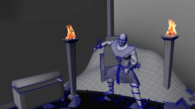
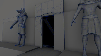
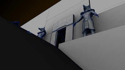
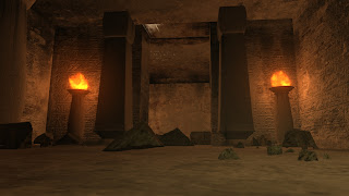
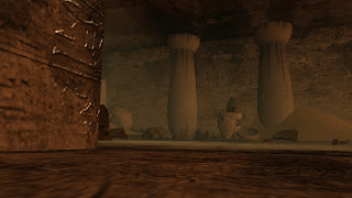
I've been doing some changes to the cameras on my demo reel. Slowing things down, more cuts. Trying to create a more subtle mood. Here's a pre-visual of the new angels and shots.


Saturday, 24 December 2011

Merry Christmas and Happy New Year!

Merry Christmas everyone and Happy New year! This year I put my digital art skills to work along with some sketching to put together a small christmas card for my friends and family. But I thought I'd share it online as well.

Happy Holidays!

Saturday, 3 December 2011

Sketch and draw app

Got this new app after playing around with on my friend Jenny's tablet. Its lots of fun. A bit clunky using the finger on the smart phone but still fun. Here 's a few samples of the quick sketches I did with the app.


Wednesday, 9 November 2011

After Effects and Fire Frustration!

Recently I re-rendered my character scene from my reel. This time I rendered the background, character, and torches all on separate layers. So I could apply a darker tint to the background behind my character in post, while keeping a brighter and warmer tint on my character and near the torches. Once they were rendered it was pretty easy to get the tint on the background. The problem arose when I bring the fire in. To preserve the crispness, I needed to keep the fire alpha straight and not pre-multiplied. But then I had an issue where the fire looked great inside the torch, but when it was overlayed on the background the tone faded and I had a wonder line when the torch base ended and the air began. So my first approach was to import pre-multipled versions of the fire and mask out the straight matted on the fire that was in the air. But that was so much of a headache to get the timing right, and wasted a couple hours. So then I started exploring more effects in program. Came across an alpha channel folder, and was able to adjust the alpha levels, and Eureka!!!

Here's some stills showing the before and after:


Before:


And After:


Such a simple solution, if only I came up with it first :(. But live and learn.

Tuesday, 8 November 2011

More Digital Painting Fun

Had some time while I waited for my fire to render off today, so I thought I'd get back to practicing my digital painting. Again, thanks to Greg Martin for the awesome tutorial for making a star field:
http://gallery.artofgregmartin.com/tuts_arts/making_a_star_field.html


Here's my version I made while reading his tutorial. Still not perfect, but its a start.


Tuesday, 1 November 2011

Render Fun Fun

Made some changes to my character. Changed his collar piece and changed the torch bases around him to bring more emphasize towards him. Currently the fire is off because I'm rendering them in layers now, so I can do some work in after effects to color correct a little, and bring even more emphasis onto my character.

Monday, 31 October 2011

Digital Painting

I'm been trying to get myself to do some digital paintings. Its often difficult to find a really good tutorial online for them. But today I found a pretty good one to make a quick and dirty planet. Here's a link to the original tutorial : http://gallery.artofgregmartin.com/tuts_arts/making_a_planet.html

And here's a sample of my attempt at it:


It was pretty easy step by step tutorial and a fun read. I hope I can find more like this. Its done by Greg Martin and he has a large gallery of other paintings he's done. Some really amazing pieces.

Monday, 24 October 2011

Wireframes

Today I got my wire frame pretty much done. A couple tweeks here and there before I render, but I'm liking it. The ambient occlusion does help to ground some of the pieces and gives it a nice feel. Here's some sample renders:


Tuesday, 18 October 2011

Flash Fun

During the last few days I've been toying around with Flash for my website. Its been over 10 years since I last used it and I forgot how much fun it can be. The coding has changed a lot and so I found it a little frustrating to get the links to work. But I found a great video tutorial that worked out great. Now I just need to work on the design of the site. I'm thinking of doing some sort of ancient scroll with my logo on it with the links laid out horizontally under it and the content below that. I have a long term vision of the scroll unrolling with each content switch and maybe my character holding it up, but that will take a while for me to get the coding and animation down.

I have been trying different methods for building my site. I use to build them all the time, back in the day, but my coding is rusty. HTML came screaming back to me, and I picked up CSS pretty easily. Also been using a bit of wordpress to help speed up the process. Although I have found flash to be a little easier from a designers perspective. With html and wordpress you write the code and preview the results. With flash you build the design elements and then right the code to transition the actions. Its a lot more fun that way and a bit easier. I'm looking forward to designing this website more and more each day. Just playing around in Flash is fun enough already.

Wednesday, 5 October 2011

Approved!!

Approved for the grad show and demo reel is complete. As always there is still more I can do with it, but I am pretty proud of what I was able to pull together. Check it out:

Saturday, 24 September 2011

Expressions are my new best friend

Last week my teacher, Rupert, suggested I do an expression for the light flicker of my fire. So today I looked up one on the interwebs. Got a pretty good one. Having never used expressions before in Maya, I was slightly confused on how to do it. But after a minor syntax error, I was able to get it to work pretty darn good. Just a simple random expression in the intensity of the lights, piece of cake. It was so easy, I'm seriously going to look into more expressions in the future, they're so simple. Here's a sample render of the flicker with the fire. Took off the textures to speed up render time, and dropped my settings to draft and a 4:3 aspect ratio. But even at that low quality you can see the awesome shadows the flames are making, especially in the second room. The 3rd room not so much, because I didn't have the light in the fire. But I do now and it looks great in the stills.


Can't wait to see it with textures and higher quality settings. The final render will be awesomesauce!

Thursday, 22 September 2011

Note to self, Compress After

So I had a bit of a frustration doing my sequencing today for my final pre-visual. Couldn't figure out why my intro and out credits were not showing up in Premiere. Then I realized that when I rendered them in After Effects, I compressed them, duh. Which made them run really slow in premiere. Plus it didn't help I was working off a network, (doh). But once I got the project on the hard drive, and got the raw uncompressed clips from After Effects, it was smooth sailing. Here's a sneak preview (in playblast form):


And here's some test renders:


N.B.

In addition to my previous post, its seems mental ray materials and normal maps are a tricky and finicky thing to work out. For now, I think I'll just leave him with a simple blinn or lambert. He looks fine with it, maybe later I'll go fancy with the realism and sss.

Monday, 19 September 2011

Hmm sss glitch

Today I made my Sss sharer for my character.  But when I went to plug my normal map into it, Maya would crash. And even worse, it causes Maya to crash when I opened hypershade or even the attribute editor for the shader. I hope its just something wrong with the computers at school. It would really suck if I couldn't get the Sss to work. I'll try to sort it out tomorrow in class.

Saturday, 10 September 2011

Saturdays Spent Rigging

Today I was buzzing away at the rig for my character. I do enjoy rigging but it can get tiresome. Eventually I do have to take a break and get back to modeling and texturing. But I got a fair amount done, still tweaking the deformation. For my immediate purposes its probably too complex of a rig, but maybe in the future I may want to animate my character. I was considering some sort of fight animation sequence, but that is something to consider for later. But here's a sample screen shot of the rig:

Friday, 9 September 2011

Transparency switches.

Today had a bit of a challenge. Took the easy way for now but I hope to find a solution in the future. I have several piles of sand in my scene. Each similar in model and texture. But I need different transparency maps on each one. I thought of using a switch to drive the alphas to their respective objects but no dice. For now I have seperate materials for each. I've made a few inquiries around school. I might even post on a forum or two and see if there is a solution.

Guess I sort of solved it. Painting black and white images instead of alphas. Much better for the work flow. Thanks Russ. Though I do feel kind of silly now that I was trying to do it the hard way. Live and learn :).

Friday, 26 August 2011

I made fire!!!!

I have been trying for the last week (in between texturing and lighting my demo), to get the torch fire working right. The instant fire button in dynamics is so quick and dirty, plus its awesome results! My problem was my scene was sooooo small. So when I shrunk my emitter object down the fire sputtered out and looked terrible. So I decide to take my whole scene and scale it up. And eureka! The spheres I used to make the torch fire turned out great, fit perfectly into the torch columns I made and it looks not too bad. Had to crank up the density and lower the fire scale, but they're a pretty good start. With some tweaking and more lighting it would look awesome. Unfortunately I just spent the last half an hour reposition all my camera keys because of the scale up. So very happy with my demo and how its coming along. My task in the next week is to take a look at my character. I did a pretty good uv on him today, so we should be able to get into texturing him and the Anubis statues out front. Here's some sample renders of the fire and tomb in progress:


Tuesday, 16 August 2011

EA tour day

Today we got to go check out the amazing huge complex at EA. Jade and I got a bit lost finding the main entrance but two guys on their coffee break directed us in the right way. Walked in and there was our teacher, Rupert. The lobby was by far the largest and smanciest of all the studios I've been to date. Large TVs with game trailers playing. A 360 TV in the middle.

Around 2 we met our guide from HR, Sarah. She gave us our name tags and took us into a theater for a presentation by one of their programmers. Gave us a great talk about all the different types of positions they have and some of the various projects they do. Also a clip of the rick Mercer report where he came to EA and got a tour and did some motion capture. That was hilarious.

The tour afterwards was awesome. Such a huge complex. Soccer field, full gym, theaters, four "themed " levels. Pixels on one floor, waves for motion on another, and wide open windows on the top for light. So many cool things. Dry cleaning and a barber. They really want you to enjoy your trip.

Thursday, 11 August 2011

SIGGRAPH The Last Day

Today wraps up a great week @ SIGGRAPH. Went to lots of great production sessions. Of course the great swag!

Started today off with standing in line before the exhibition opened to finally get my Pixar posters. It was a mad rush at 9:30. I got two posters and Mai got three.
After that we went around the exhibition for a slough of pins and other bling. Afterwards we went to Starbucks for a quick coffee before the ILM talk at 10:45.

The ILM talk was about Cowboys and Aliens, Pirates on stranger tides, and Transformers 3. What was cool about the work they did on Cowboys was the molten gold effects, especially when it melted the aliens. With Pirates it was the extensive back and forth between ILM and the director over the design for the mermaids. ILM wanted to go more creature and scary. Which the director liked buy wanted to keep more of the beauty of the actresses. And finally the shear volumn of detail done in the assets for transformers was amazing. Colossus alone was approximately 30 million polys. Millions more than any other transformer made before.

The Line to get into the Exhibition at 9:30

The Line to get into the Exhibition at 9:30

The Line to get into the Exhibition at 9:30 and the mad rush to Pixar Posters

Models made with plastic, special sculpting machines take 3D models and make them

Coral plastic scuplture

Artist constructed a whole helmet to make a Batman costume

more plastic sculptures

more plastic sculptures

so cool!

awesomesauce!


another company that uses the machines to make sculptures from 3D models out of almost any material


Artist designed the outfit and the company made


Zbrush talk

Autodesk Booth


Autodesk Lectures

AMD


Todays loot!


Worth the wait!


Following that talk we went to line up for teapots again from Pixar. This time the line did about a full circle around the exhibition hall. Ranim met up with us to get a teapot too. Waited for about an hour. But this company from Ontario was doing a contest with buttons. They gave you 6 of one color and you had to get one of each color from people around the exhibition. It was lots of fun. I made a run up the line to get all 6. Met some people in the process. Of course my badge was already covered in tonnes of pins, so I had people asking me where I got them all, which was super fun. So I got my six and got to enter to win a blackberry Playbook. Hope I win!
After getting our tea pots, we took Ranim over to the job fair. She talked to a couple people and gave her reel to one company. So excited for her, hope she gets work. She has a great reel. Soon I'll be in the same boat trying to market my reel and get work.

Later we headed up stairs to show Ranim the art gallery but it closed down. But we did run into one of Mai's friends who did this reel about sheep. I always liked it and it was cool to meet him. We talked for a bit about the teachers we had in common from Vanarts. But then he had to go to a session that was starting. I decided to call it a day and left Mai and Ranim to their own devices.

Well that about wrapped up my final day at SIGGRAPH 2011. It was a fantastic week. Went to some awesome production sessions on some of the best movies of the year. Got some inspiration and something to strive for in my own work. That week went super fast but I had so much fun! Hope I get a chance to go to another one in the future.